Communication | MKG Praxis Rheine
In the best hands
sieger design has developed a website with high recognition value, striking images and emotional appeal for the young MKG Praxis Rheine
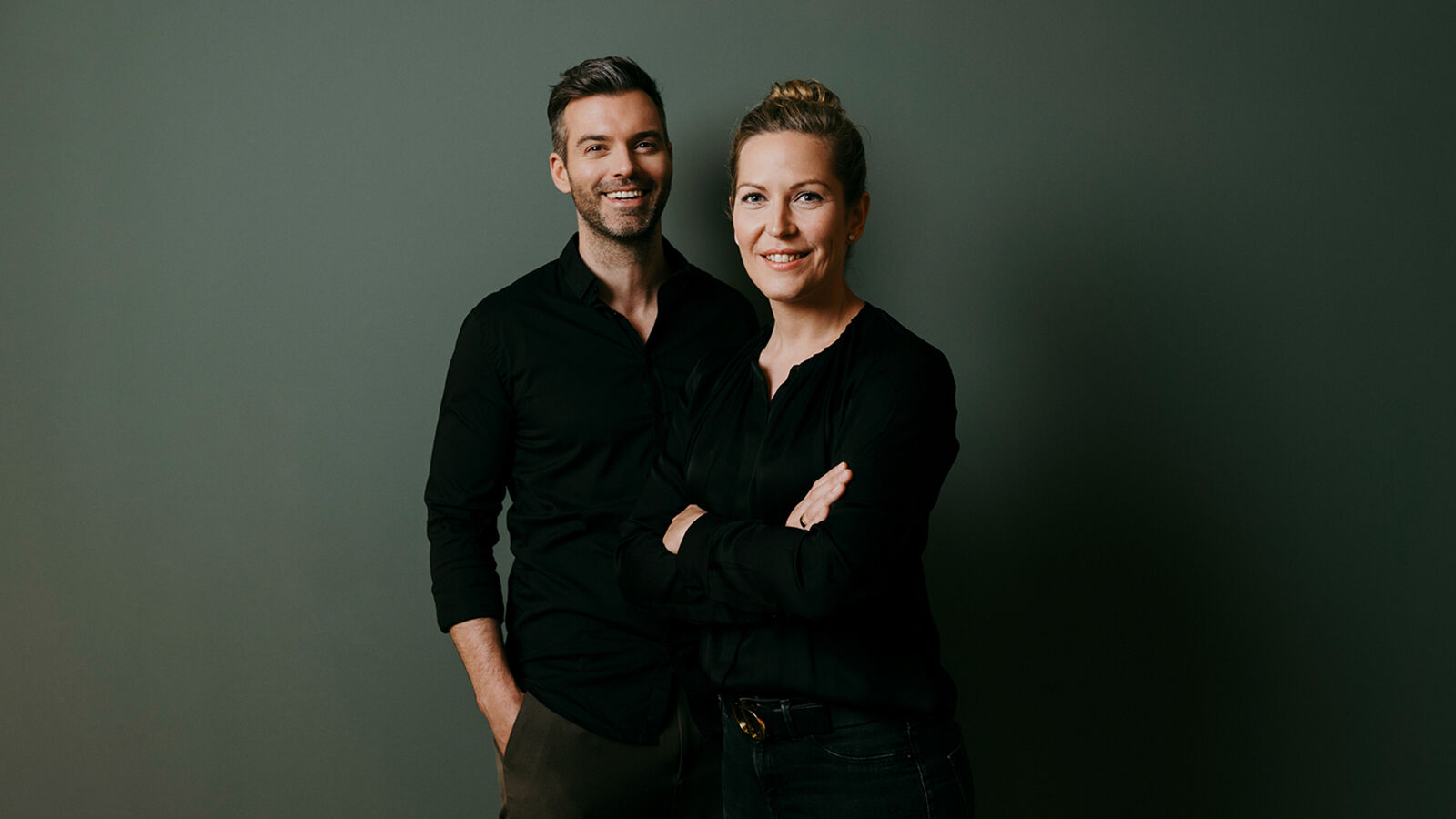
In 2021, Dr Eva Essmann and Dr Markus Mönninghoff wanted an unusual corporate design and website for their new joint practice that would clearly stand out from the look of other practices. The skills of the young team had to be clearly presented. Alongside a high degree of medical precision during surgical interventions, this also includes exacting aesthetic standards – a combination that epitomises the prowess of Essmann & Mönninghoff.
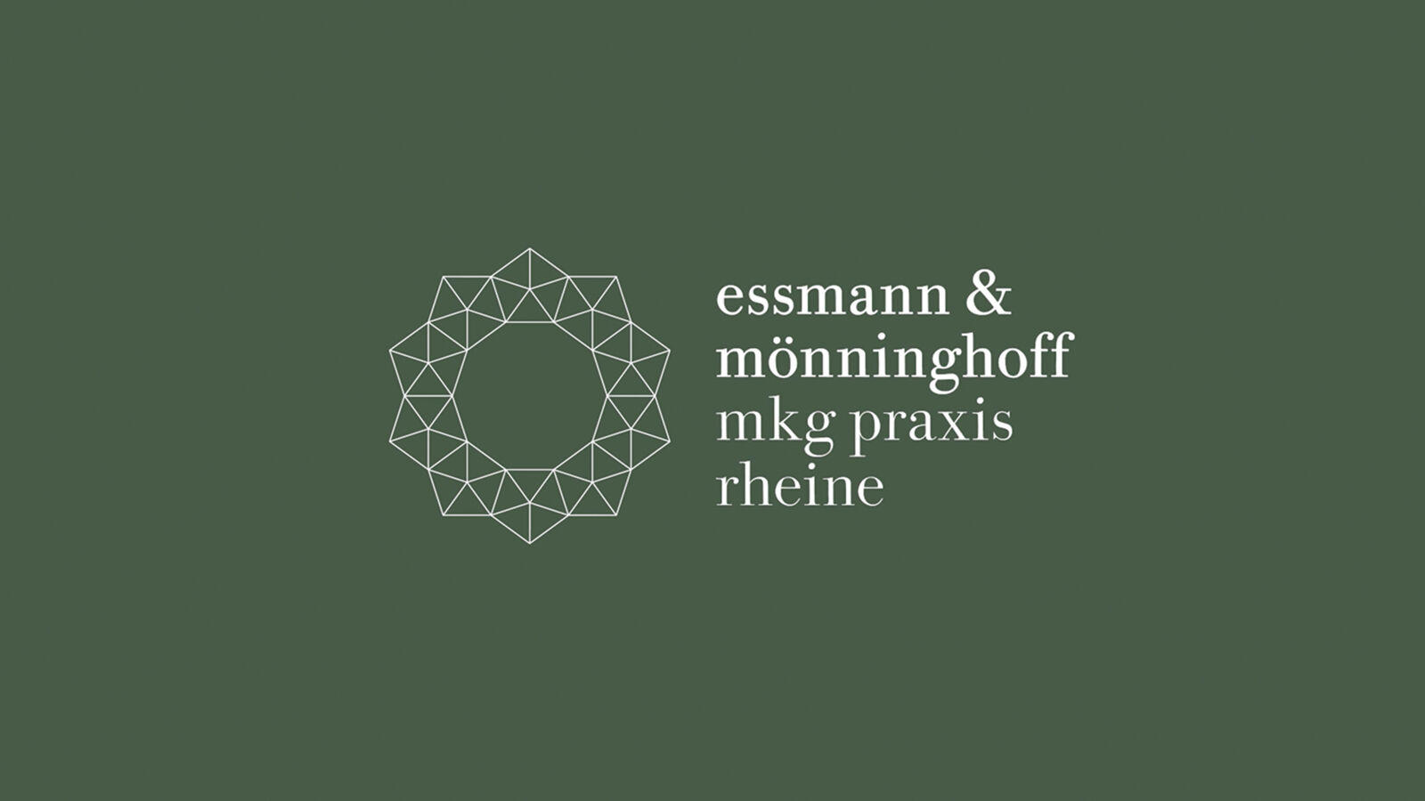
After detailed analyses of the competition, various logo concepts were developed along the theme of oral and maxillofacial surgery. The agency team was delighted with the decision to select a design that expertly refrained from using obvious connections to the subject area. In fact, the signet stands out thanks to a construction that borders on technically sober, along with a harmonious, refined composition. Together, they represent the skills of precision and aesthetics.
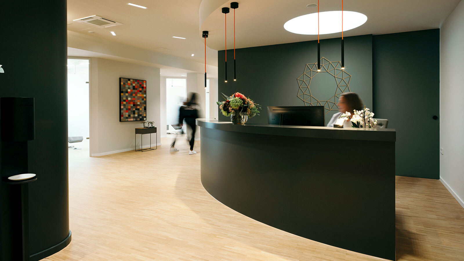
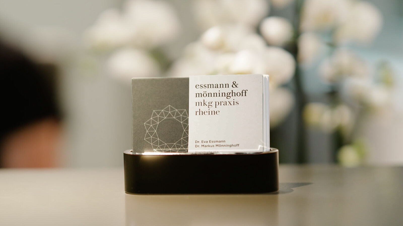
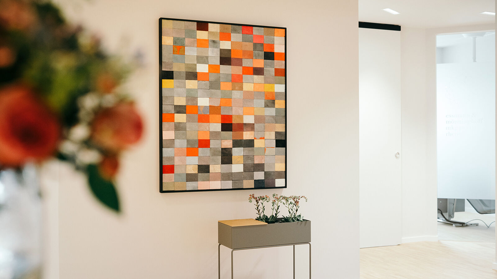
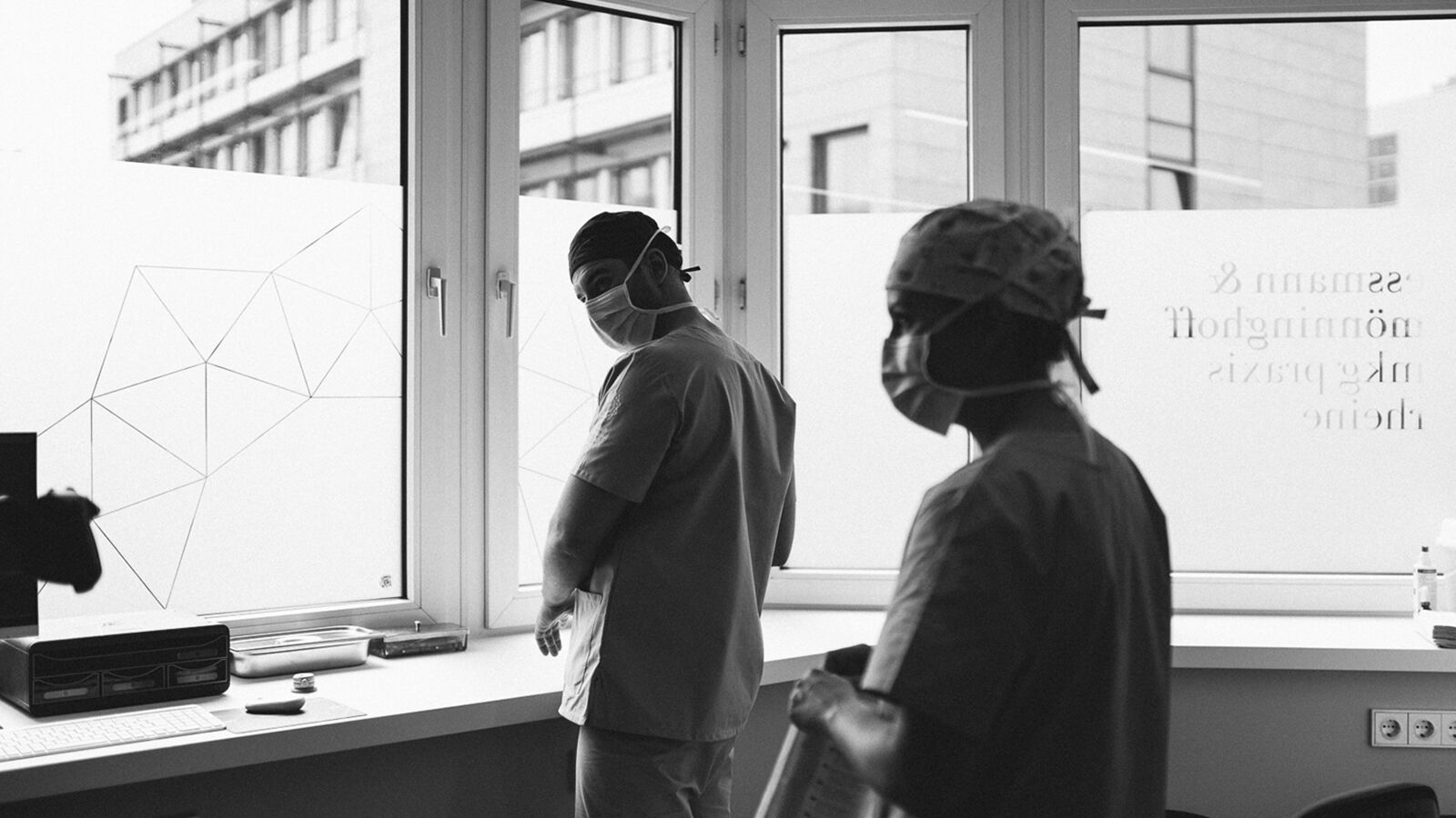
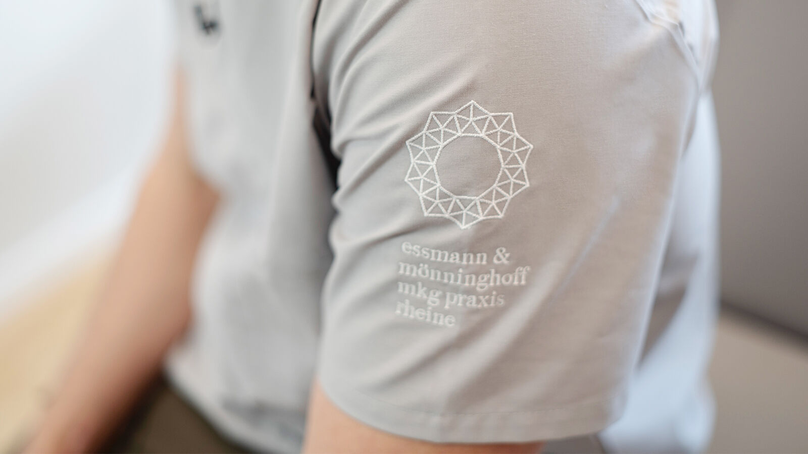
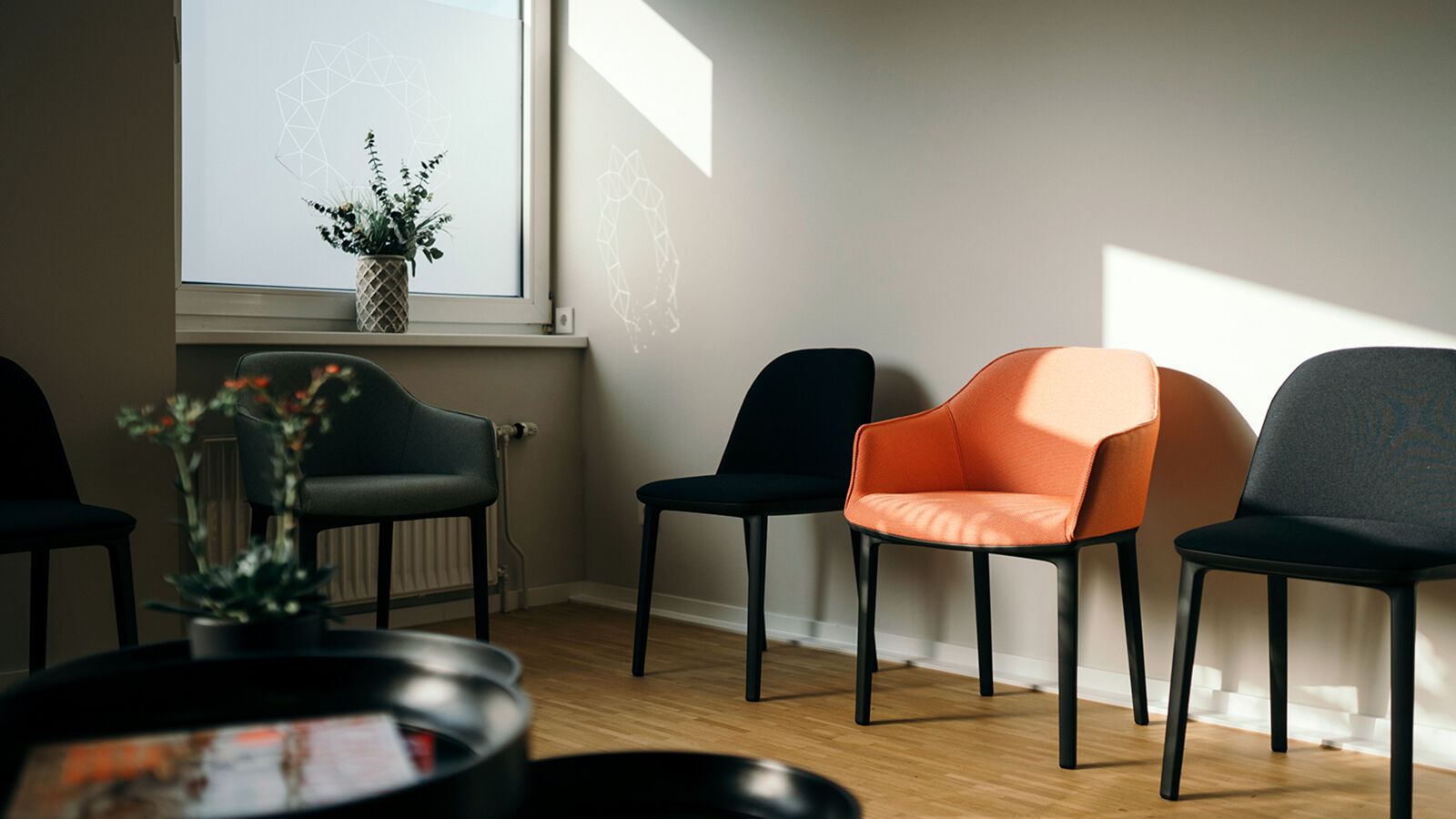
The logo’s figurative mark is based on triangles that form delicate pentagons and a wreath. Its circular shape can be associated with the facet cut of a gemstone, but also with a flower or abstract sun. This is complemented by the word mark in traditional typography based on the typeface Bodoni. Left-justified and written in lower case, the lettering ‘essmann & mönninghoff mkg praxis rheine’ appears almost youthful and modern – yet high-quality and trustworthy at the same time. The striking logo generates so much stylistic potential that it is also used within the interior architecture in various areas of the practice.
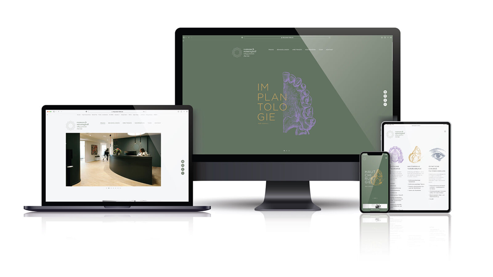
Skills such as precision, expertise and knowledge of aesthetics form the bedrock of the website. An aesthetic presentation that is unusual for medical content sets it apart. The consciously reader-friendly text formulations also make complex content comprehensible for users who are unfamiliar with medical terminology.
The website’s home page welcomes patients with artistic drawings combined with typography in contrasting colours. The dark-green background evokes nature and is visually offset by the colourfulness of the illustrations. An upper jaw, a butterfly and an eye are the symbols for the practice’s specific treatment areas. They serve as quick orientation in the three areas of implantology/maxillary surgery, skin surgery/tumour surgery and aesthetic surgery/wrinkle treatment.
The anatomically accurate presentation of a human jaw is unusual and bold, and has a disconcerting effect in this context at first. At the same time, the bright-purple colour scheme makes this illustration appear fresh and casual in an unusual way. The aesthetic implementation is authentic and helps the website stand out clearly from the field of dental medicine.
The MKG Praxis Rheine website aims to set new standards in aesthetics and usability with its combination of distinct design and the presentation of complex medical content using comprehensible language.
- Request project information
- Share project
- Add project to favouritesRemove project from favourites