Communication | Jochen Pohl
Uncompromisingly open
sieger design developed jewellery designer Jochen Pohl’s catalogue for Baselworld 2017
“Striking without being gaudy” is how you might describe Jochen Pohl’s unique jewellery pieces. The sieger design team applied this same principle to its design for the jewellery maker’s 2017 catalogue for Baselworld, the top event in the industry calendar. The process was marked by a spirit of openness: both in the close collaboration with the longstanding client and in the design of the large-format print catalogue.
sieger design has been working for the south German jewellery brand Jochen Pohl for over ten years. But their work together has never become stale or boring. Each of the catalogues sieger design has developed for Baselworld has been a unique piece in its own right that explores different facets of the world of jewellery.
Jochen Pohl’s precise ideas and creative visions pose new challenges for the sieger design creative team with each project they undertake together. The diverse ideas and requests take concrete form through a process of intensive dialogue. “The trusting client relationship, which has been steadily built up over the years, makes it possible for us to constantly go in new directions,” remarks Michael Sieger. “The key is to remain unwaveringly open to new ideas.”
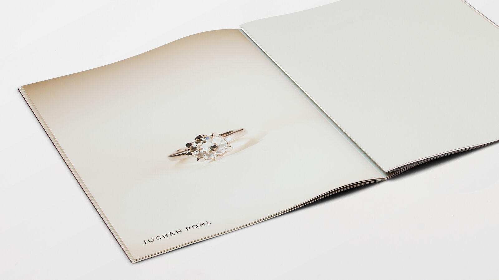
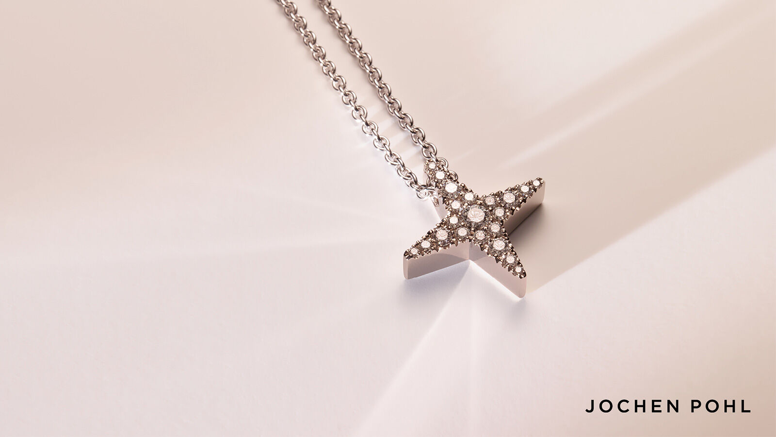
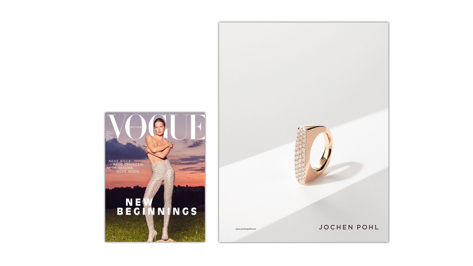
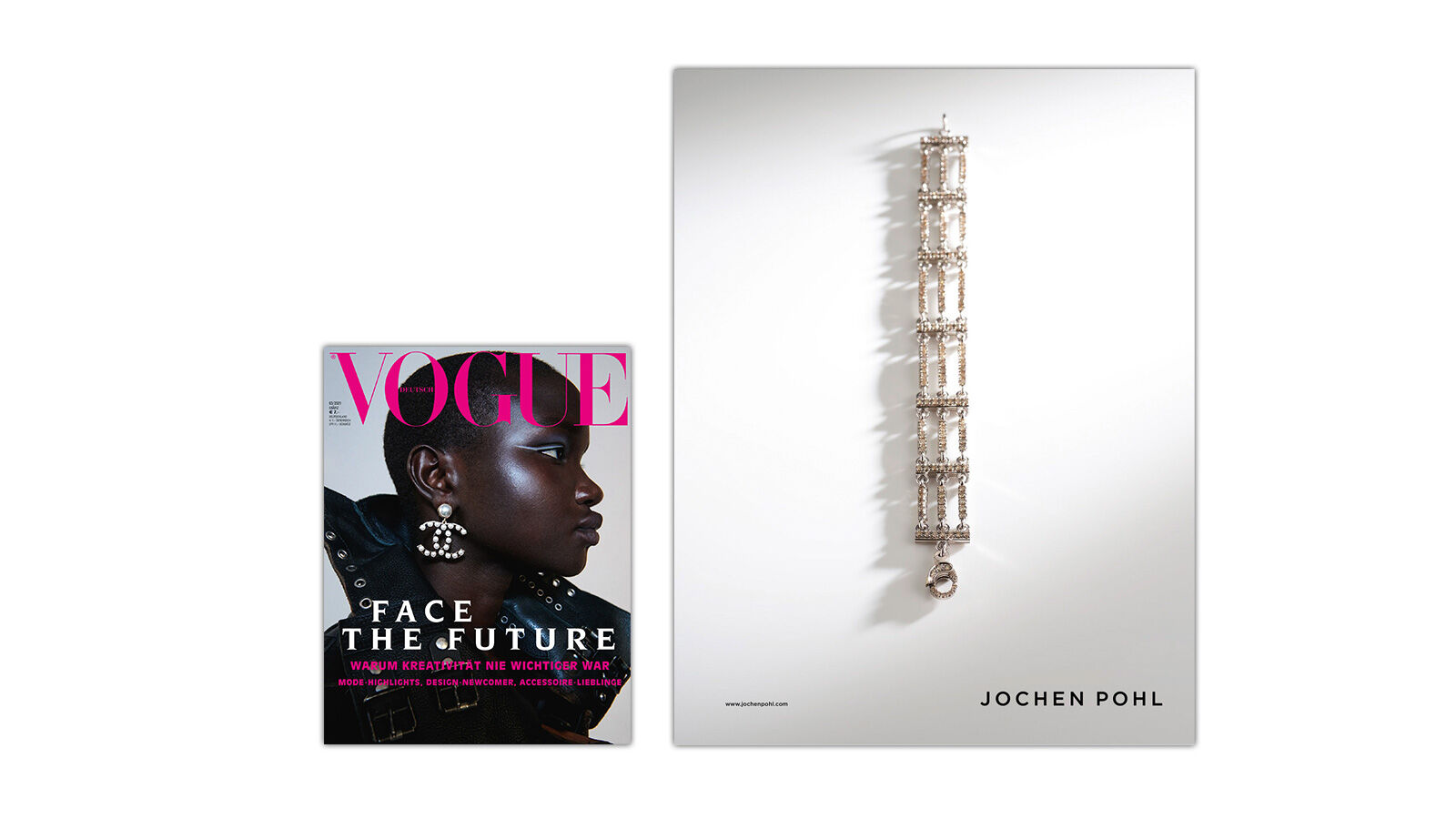
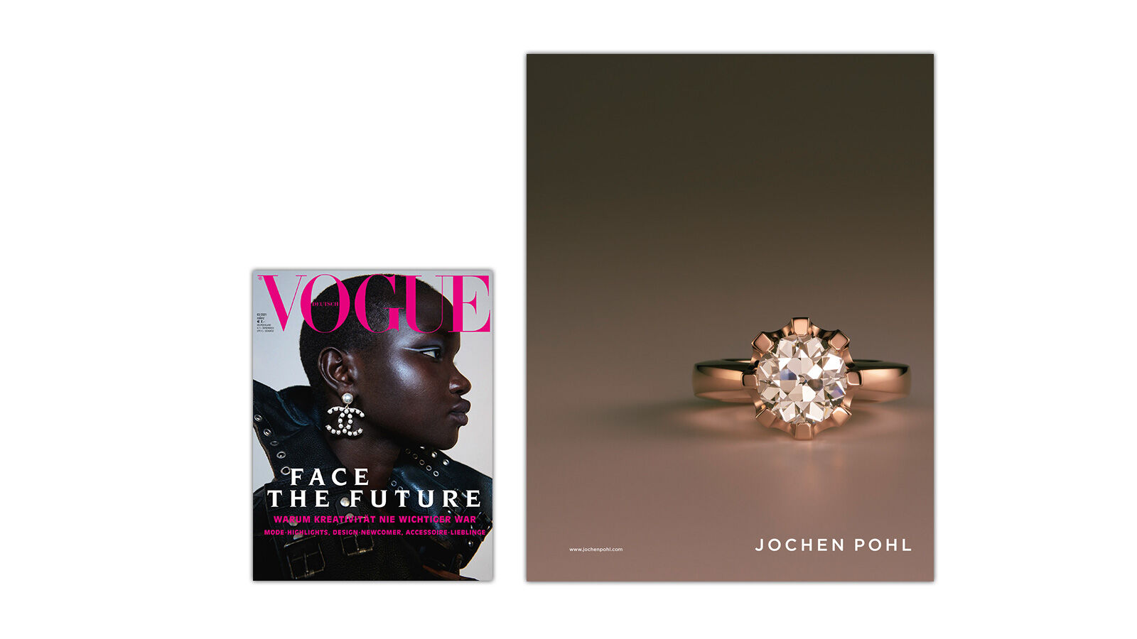
The key goal for the 2017 catalogue was to combine discreet, high-class elegance with maximum opulence. sieger design achieved this through the choice of uncoated paper, whose velvety texture gives tangible expression to the powdery soft nude shades used in the backgrounds of the catalogue images. The effect is heightened by the unbound, large-format double-page spreads. The loose catalogue pages can be rearranged over and over again, resulting each time in thrilling, harmonious new combinations of colour and jewellery.
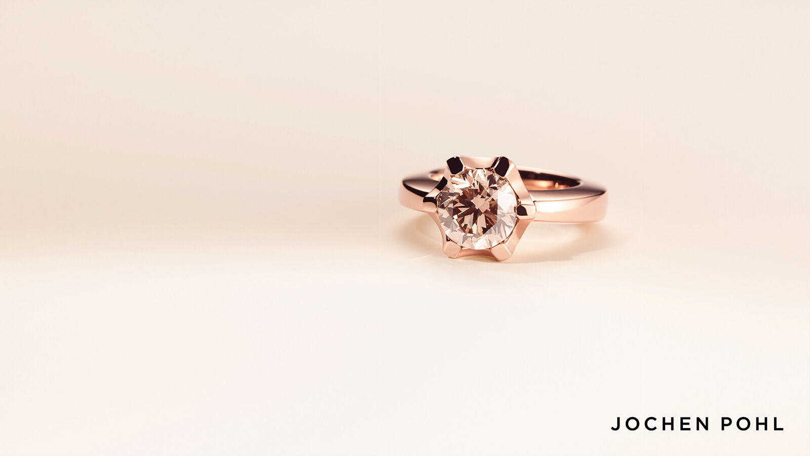
The rings, bracelets and pendants are presented in extra-large scale, with each piece given a double-page spread all to itself with undivided attention. Their iconographic power is underscored only by the brand name, which appears in a clear, sans-serif font on each page.
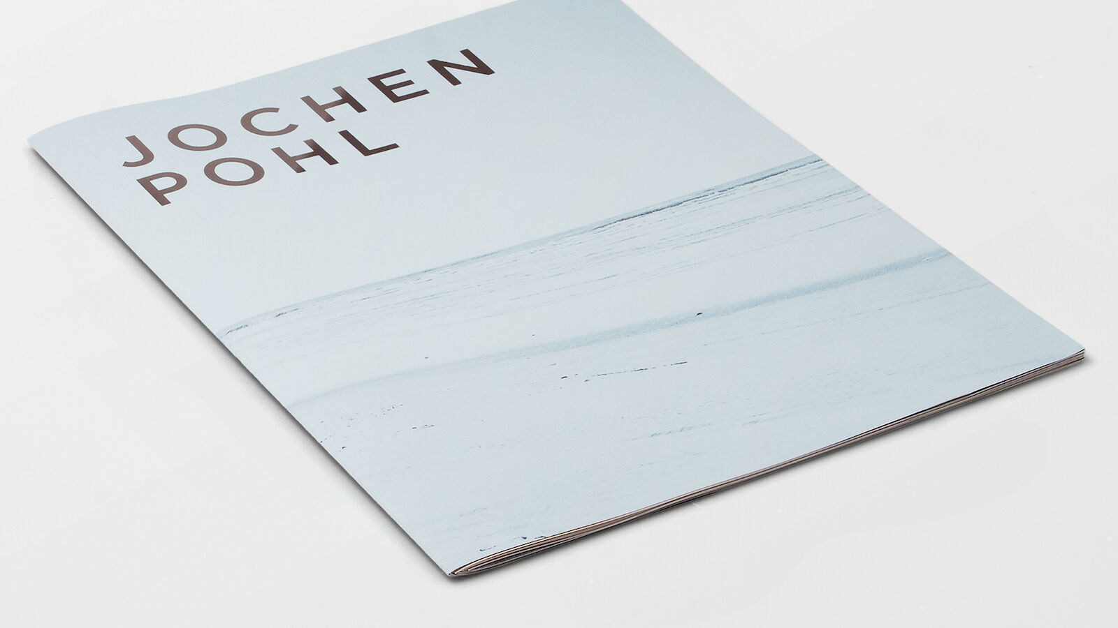
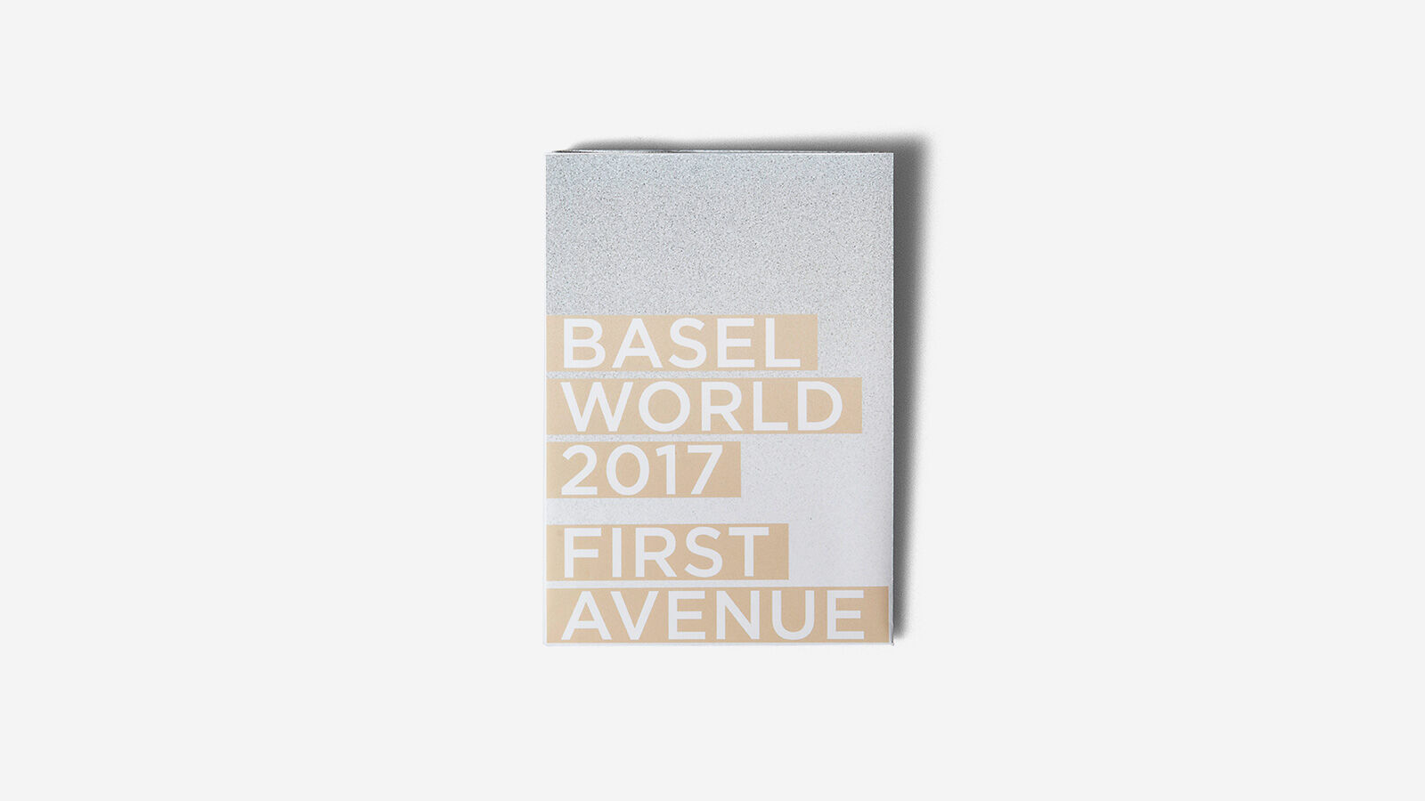
The cover emphasises just how strongly the name “Jochen Pohl” stands for exceptional, one-of-a-kind jewellery: the finely embossed wordmark alone is all that is needed to hint at the unique, precious pieces inside. The glittering, metallic letters mark a visual and tactile contrast to the matt-finish paper, and subtly underscore the minimalist yet opulent style.
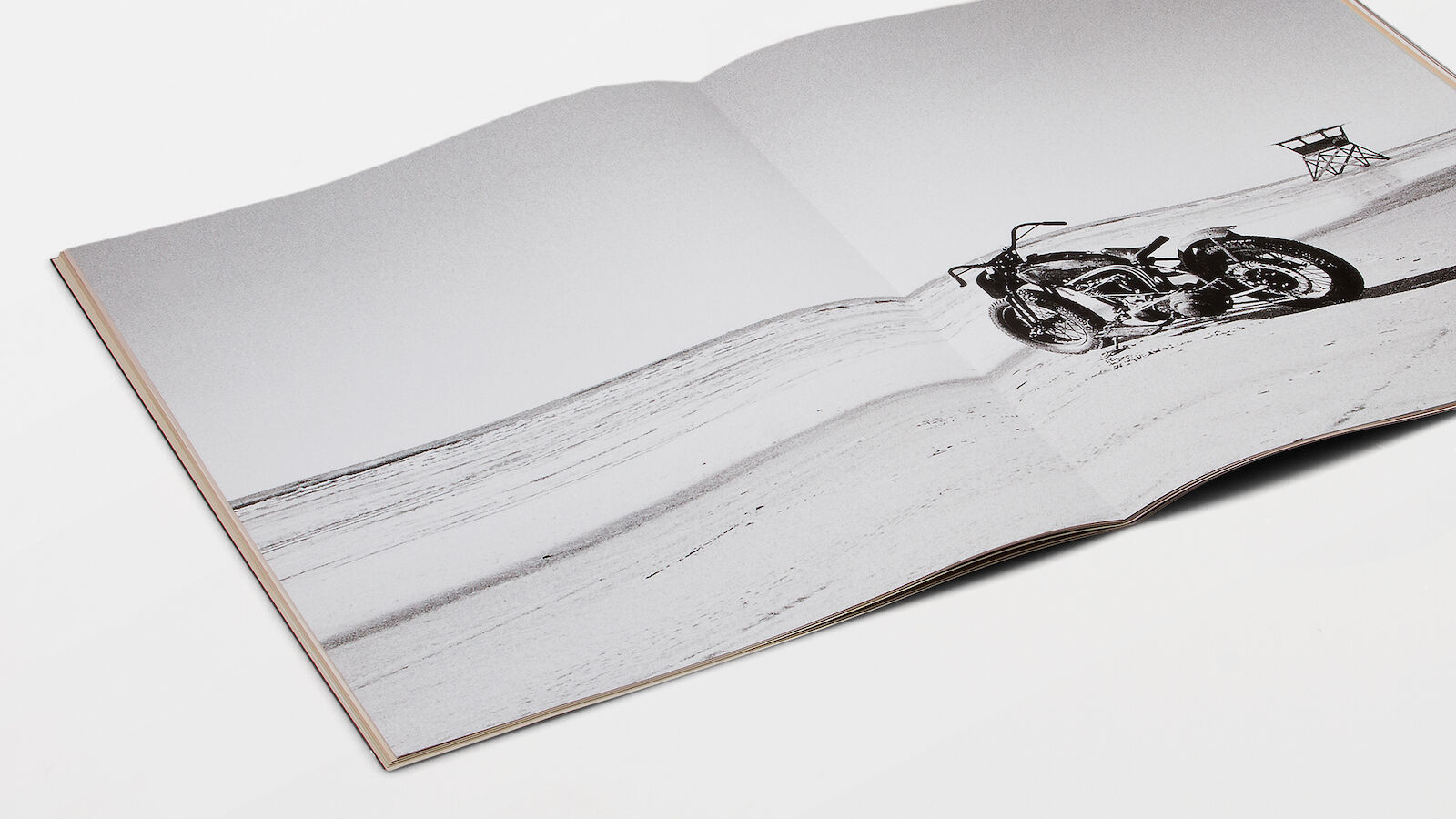
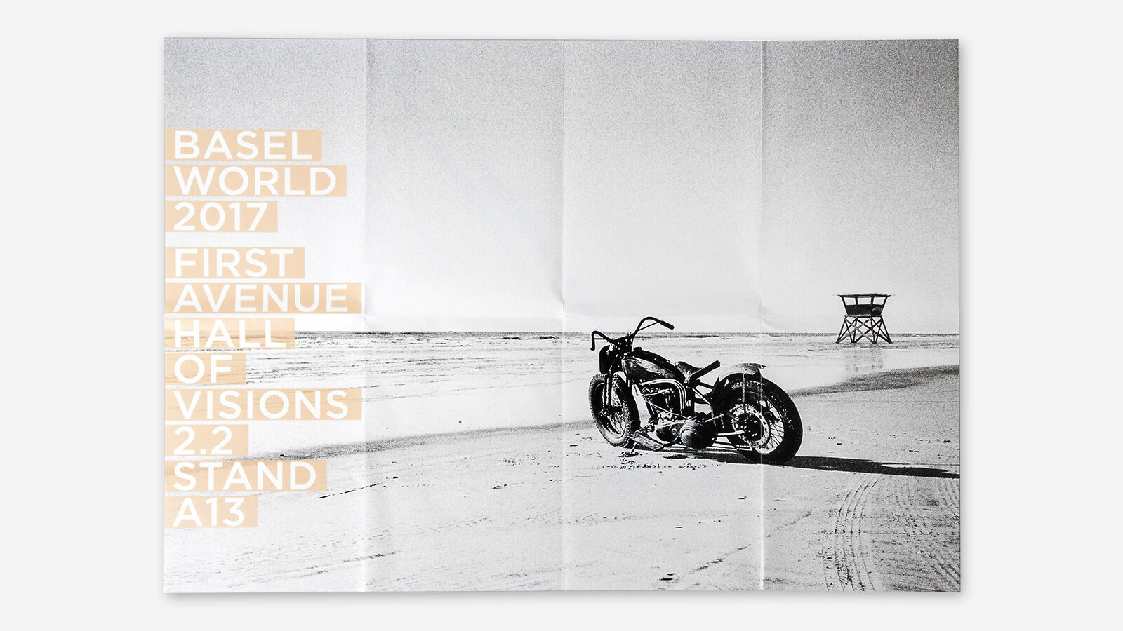
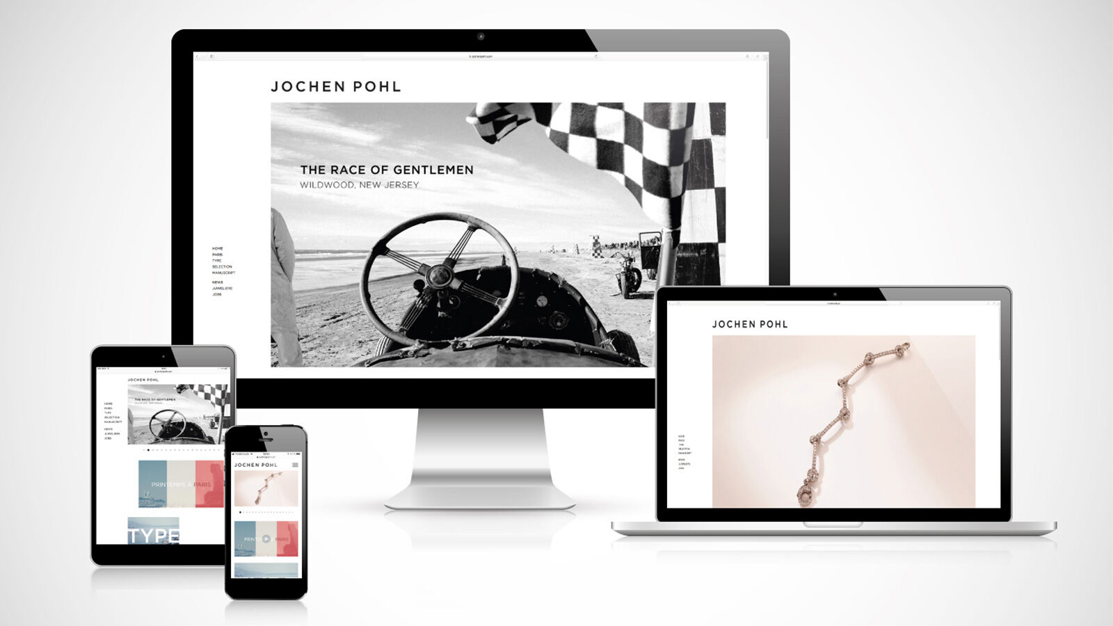
Appearing alongside the jewellery photography are grainy, black-and-white snapshots of beach scenes taken on an analogue camera by documentary photographer Johannes Huwe. While at first glance the images appear unrelated, closer inspection reveals a unique affinity. The photographs show The Race of Gentlemen (TROG), an annual celebration of a bygone era of motorsport organised by Oilers Car Club and the American Hot Rod Foundation that brings free spirits with Hot Rods and bikes to the beach of Wildwood, New Jersey. Each vintage vehicle is a one-of-a-kind piece, embodying a love of detail, meticulous artisanry and a passion for the exceptional.
- Request project information
- Share project
- Add project to favouritesRemove project from favourites