Communication | P / E / P Architekten + Stadtplaner GmbH
Clear and authentic
sieger design translates the architectural firm P / E / P’s standards of clarity and authenticity into a new corporate design
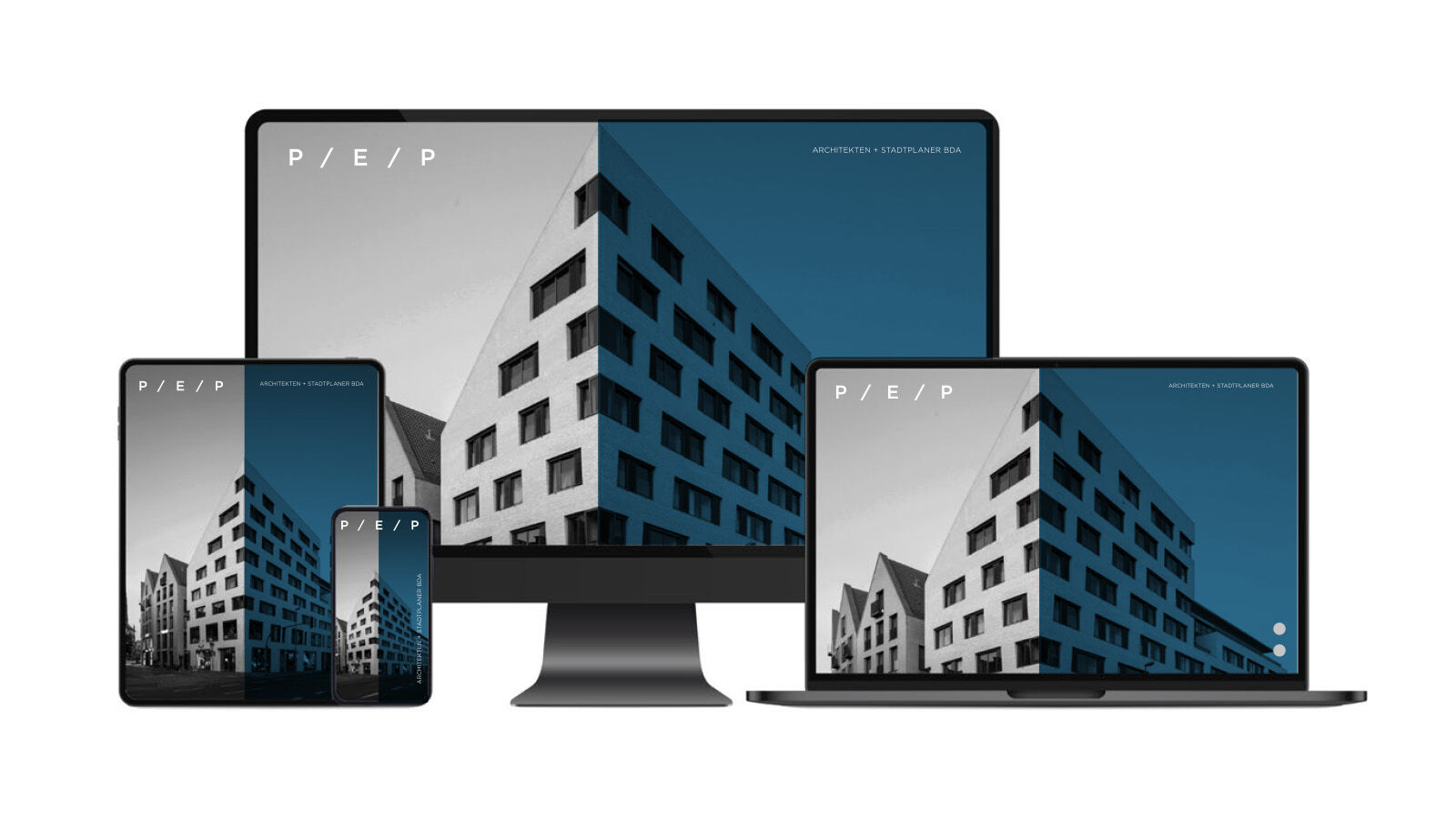
Alongside the relaunch of the corporate design, the company’s new website is at the heart of the communication concept for P / E / P Architekten und Stadtplaner from Münster that has been implemented in 2023.
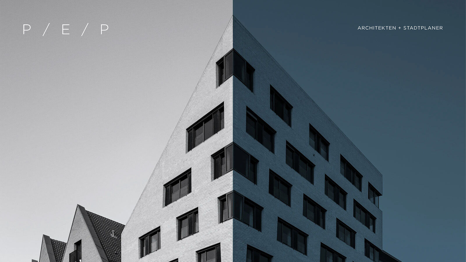
The design signature of P / E / P Architekten und Stadtplaner from Münster is demure and minimalistic. The firm has made a name for itself through its approach of combining economically viable solutions with high architectural standards. The partners wanted a concept from sieger design that reflects self-confidence and understatement. As a team of architects and urban planners, P / E / P always considers sustainable use of the districts when planning new constructions or renovating existing buildings. This philosophy gave rise to the Alter Fischmarkt Münster project, for example, an ensemble of newly interpreted gabled houses that adds evolutionary development to the historic location and has attracted attention from further afield.
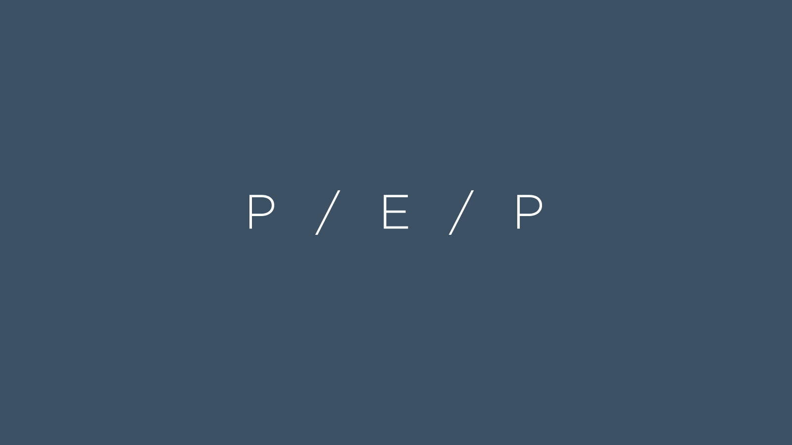
The new logo by sieger design translates the clear stance of the architectural firm into a minimalist word mark with iconic character. It consists of the first letters of the three founders’ names in Gotham light font, optically separated by slashes with wide spacing so that the initials of the founders’ names develop into solitary units. The fine slashes can be interpreted both as hallmarks of modern digitisation and as abstract allusions to classic gabled roofs. In this way, the logo oscillates between the traditional and the modern without losing any of its clarity and unambiguity.
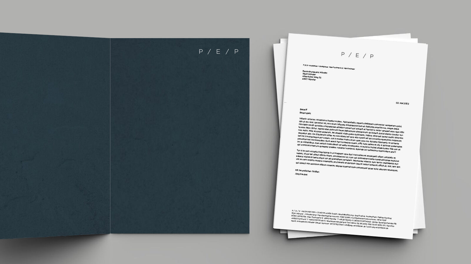
Due to its high profile from more than 40 years of construction activity in Münster, the company name P / E / P was retained in the revised logo. It is quickly accessible via the computer keyboard and simple to use. Due to the defined spacing, the logo can be integrated into copy text without losing recognition value.
sieger design lets the quality of the projects speak for itself on the website. Images that are as large as possible, accompanied by few texts, underline the clear aesthetics of the constructions and plans from the architectural firm. This clarity is reflected in the structure of the website, with easily accessible content and self-explanatory filter options. The dark shade of blue stands for tradition, respectability and reliability, because P / E / P is a firm that is known for making a project not only beautiful, but also successful.
- Request project information
- Share project
- Add project to favouritesRemove project from favourites