Communication | Jochen Pohl
An epic tale in images
sieger design develops “Odyssey” jewellery catalogue for Jochen Pohl as a journey across many genres
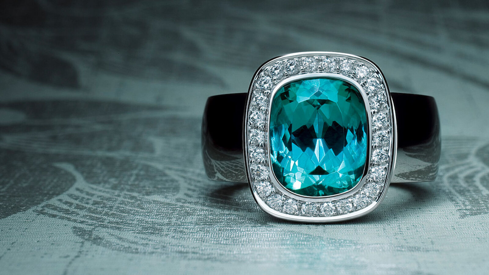
Deep darkness and rich associations – the second catalogue, which was developed by sieger design for Jochen Pohl in 2007, caught readers unawares. The rings set with precious stones are presented in an often striking mixture of photographs, graphics and typography that abruptly alternates between styles. Nevertheless, the pieces of jewellery captured in photos by Ernesto Mertens retain their individuality, showcased on high-gloss double-page spreads.
No single spread allows the observer to become accustomed to a particular design style, as the next double page makes a whole new statement. Large-format images of the Jochen Pohls rings, as well as unusual maps and collages follow on from one another with a faint sense of continuity and call to mind music video sequences – but this is by no means arbitrary. The image of the journey invoked by the “Odyssey” title serves to frame the ensemble.
22 large-format double-page spreads reveal different worlds and are set against a deep black space. Fantastical and unconventional scenarios carve out a place for the individual creations somewhere between myths, graphic art and a striking magazine-like appearance. For instance, the shot of a dazzling pink-coloured ring set with a precious stone is heralded by a two-page spread of a flamingo. Inspiration is even sourced from punk culture, which sees a glossy, razor-sharp negative of a larger-than-life skull adorn a double-page spread. The catalogue is strengthened with quotes taken from literature and music. There are excerpts from a love song by ancient Greek poet Anakreon, a Las Vegas online travel guide and contemporary lyrics from Berlin-based avant-garde jazz singer Michael Schiefer that expand the subject of travel into a multidimensional associative forum where no intellectual association is too audacious. The shifts from matt to glossy and light to dark make the publication a feast for the eyes.
sieger design developed three catalogues for Jochen Pohl; each one of them can stand alone but they are linked by their own unique style. The first of these, a glowing manifesto, was honoured with no less than three design awards and demonstrated that Jochen Pohls rings are quintessentially feminine. The designers of “Odyssey” contrasted the playful character of its predecessor with a mythical black. The boldest contrast is provided by the black cover, on which the name Jochen Pohls stands out thanks to its partly glossy sheen.
The essence of the catalogue lies in the uncompromising plea for the supremacy of beauty, as Anakreon sang about centuries ago: “and tried to sing of the feats of Hercules, but still the lyre kept singing songs of love ...”
- Request project information
- Share project
- Add project to favouritesRemove project from favourites


Would you like to find out more?
Get in touch with us: